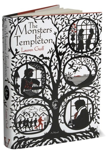
 While my sister was visiting me this past week, we spent a lot of time together judging books by their covers. This cover, for Lauren Groff’s The Monsters of Templeton was one we both loved, and though neither of us bought it, I am sure I will one day soon. Almost as good as the cover is the groovy map inside. I am a sucker for maps.
My sister said she prefers covers that have illustrations, and she is winning me over to her point of view. Best are covers like Groff’s, which were drawn specifically for the book. I also think of the covers for the hardcovers of Dorothy Dunnett’s Niccolo series (at least the ones I have, which were bought in Canada). In second place, and more common, are paintings and drawings that are reused as illustrations for book covers. We both enjoyed Sarah Johnson’s gallery of reused cover images for works of historical fiction. Sometimes the images were totally transformed in reuse and sometimes … well, let’s just say that certain covers could cause a lot of confusion.

Reading and Writing History and Fiction (and sometimes food)
Hi Lucy,
Julianne sent me here. I love this cover too! Very evocative.
I am in the process of thinking of my second book cover, so this topic is very much on my mind these days. I also enjoy Tanzanite’s Book Covers:
http://tanzanitesbookcovers.blogspot.com/
April 10? I hope you’re either reading or writing books. While I aimlessly wander around the web with a bottle in one hand and a computer in the other.
I kid, I kid. I wander around the web with a stack of papers I’m supposed to be grading at my feet, a bottle in one hand, and a computer in the other.
One more week of this then it’s no more stack of papers. And maybe I’ll read a few books too. Or even write one!
Hi Catherine, lovely to see you! I lurk on your blog from time to time, and can’t wait to read your book (must finish the university quarter first).
Mike, I know, I know. I’ll blog soon, promise.