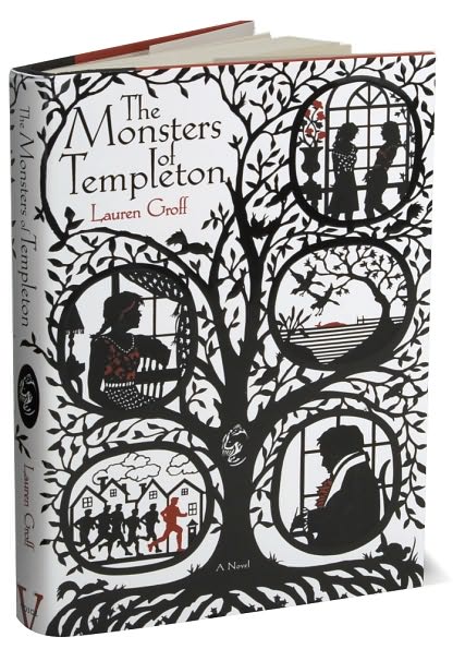
 While my sister was visiting me this past week, we spent a lot of time together judging books by their covers. This cover, for Lauren Groff’s The Monsters of Templeton was one we both loved, and though neither of us bought it, I am sure I will one day soon. Almost as good as the cover is the groovy map inside. I am a sucker for maps.
My sister said she prefers covers that have illustrations, and she is winning me over to her point of view. Best are covers like Groff’s, which were drawn specifically for the book. I also think of the covers for the hardcovers of Dorothy Dunnett’s Niccolo series (at least the ones I have, which were bought in Canada). In second place, and more common, are paintings and drawings that are reused as illustrations for book covers. We both enjoyed Sarah Johnson’s gallery of reused cover images for works of historical fiction. Sometimes the images were totally transformed in reuse and sometimes … well, let’s just say that certain covers could cause a lot of confusion.

Reading and Writing History and Fiction (and sometimes food)